What is the ADX indicator?
The Average Directional Movement Index (ADX) is a basic technical analysis indicator that comes built-in with the MetaTrader trading platform. It is used to measure the strength of a trend. Traders use ADX to gauge how strong a trend is from the point they open a position—whether at the start of a trend, after identifying a trend reversal, or during a pullback to test the trend before re-entering in the same direction. However, the ADX does not indicate the direction of the trend (up or down); it simply tells whether a trend is strong or weak. Therefore, ADX is mainly used for trend-following strategies.
This article focuses on understanding and applying the indicator, while detailed settings and configurations can be found in general resources.
What does the ADX indicate?
Illustration of Using the ADX Indicator
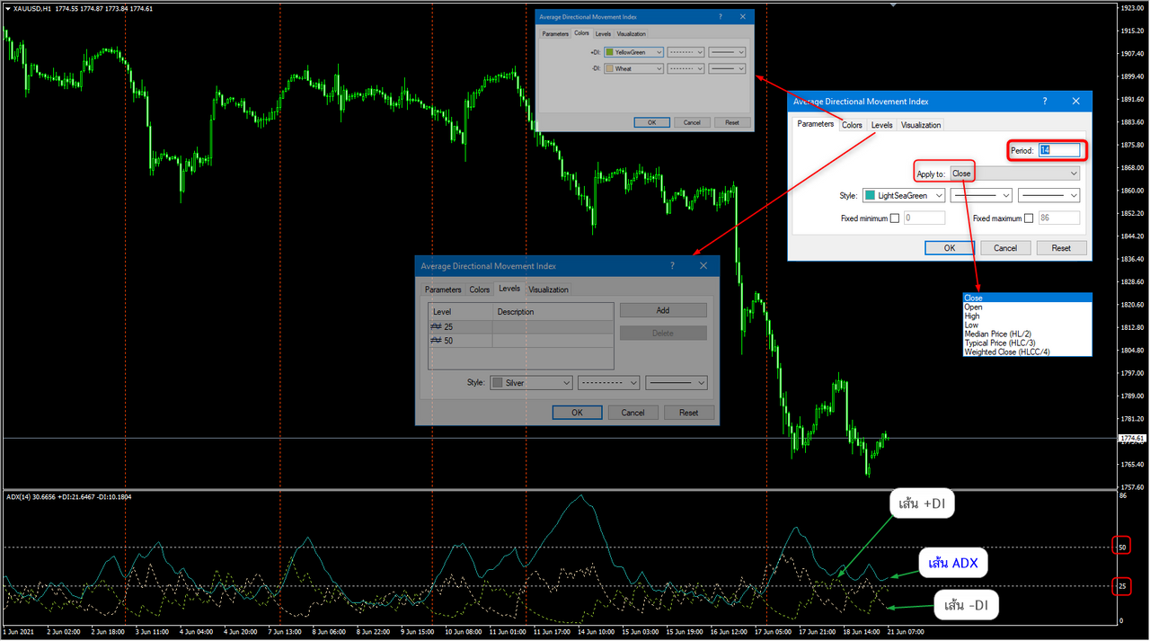
When you apply the ADX to a chart, the key default setting to understand is the Period 14. Here, “Period” refers to candlesticks—meaning that the calculation for determining the strength of the trend is based on the data from the most recent 14 candlesticks on the current chart. The indicator primarily uses closing prices for its calculations.
The ADX is displayed in a separate window below the main chart. It consists of three lines: the ADX line, the +DI (Positive Directional Indicator), and the –DI (Negative Directional Indicator). On the right side of the ADX window, you may also see custom horizontal levels, typically drawn at 25 and 50, as shown in the illustration. These levels help traders interpret the strength of the trend more easily.
Let’s See What the ADX Tells Us
Before we dive into what information the ADX provides, it’s important to understand how most indicators work. Most technical indicators derive their values from price data—specifically the Open, High, Low, and Close (OHLC) of each candlestick. These indicators may use data from one or several candles, depending on the calculation method.
Because indicators use historical price data, they act as confirmatory tools—meaning they confirm what has already happened in the market. The ADX (Average Directional Index) is no different. The ADX line shows the strength of a trend, but not its direction (i.e., whether it’s an uptrend or downtrend).
The levels commonly used to interpret trend strength with ADX are as follows:
0–25: No trend or a very weak trend. Often seen during consolidation or accumulation/distribution phases.
25–50: A strong trend. This is typically when price breaks through support/resistance levels and continues in that direction—indicating which side (buyers or sellers) has gained control.
50–75: A very strong trend.
75–100: An extremely strong trend, though this is rarely seen in most market conditions.
In addition to the ADX line, the indicator also includes two other lines: the +DI (Positive Directional Indicator) and the –DI (Negative Directional Indicator). These two lines help identify the direction of the trend, while the ADX line measures its strength.
When the +DI line is above the –DI line, it indicates that price is moving upward, suggesting an uptrend. The ADX line then shows how strong that uptrend is.
Conversely, when the –DI line is above the +DI line, it signals that price is moving downward, indicating a downtrend. The ADX line will measure the strength of that downtrend.
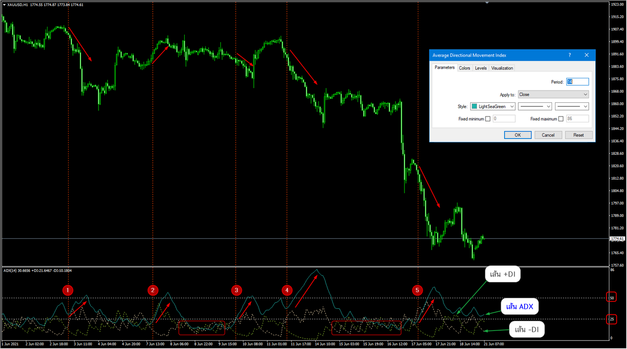
Interpreting the ADX: Look at Points 1 and 2
As mentioned earlier, the ADX does not indicate the direction of the trend, but rather measures the strength of price movement—or you could say, it reflects the momentum behind the move. For example, when the ADX line is above the 25 level, it signals that a trend is gaining strength.
At Point 1, the price is moving downward.
Here, the –DI line crosses above the +DI line, indicating a bearish move. The ADX line confirms that this downtrend has strength.
Pay attention to the slope of the ADX line—a steeper slope typically reflects stronger momentum.At Point 2, the price is moving upward.
This time, the +DI line crosses above the –DI line, signaling a bullish move. The ADX line again acts as confirmation, showing the strength of the uptrend.
Point 3
After the –DI line crosses above the +DI line, it still takes several more candlesticks before the ADX line rises above the threshold that indicates a strong trend. This highlights an important point: when entering a trade, it’s not enough to look only at the +DI and –DI lines to determine trend direction. The ADX is crucial because it tells us when the strength of the movement actually begins.
We can clearly see that meaningful price movement with real momentum tends to happen only after the ADX rises above the 25 level, which—as previously explained—is the threshold for indicating a strong trend.
Point 4
Here, the ADX line goes above the 50 level, indicating that the trend is very strong.
Look at the two rectangles where the ADX line stays below the 25 level. When you observe the price action on the chart during these periods, you’ll notice that price is moving sideways within a range, without a clear direction. This creates visible support and resistance levels at the top and bottom of the range.
These are typically accumulation or distribution phases, where the market is preparing for a larger move. Once a breakout occurs—where price moves decisively out of the range—you’ll often see the ADX line rise above the 25 level, signaling the start of a stronger trend.
How do you use the ADX indicator in trading?
When looking at a plain price chart for trading, the most important thing is to understand what the price is telling you. Indicators are simply tools to read or confirm what the price is showing. The key trading principle is to read the price first, then use the ADX as a supplementary tool to better understand the price context and what the price is doing.
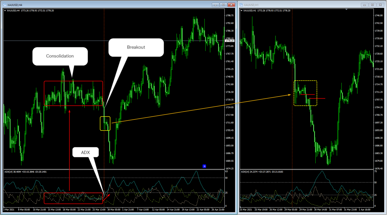
For example, when a breakout occurs, it signals an imbalance between sellers and buyers, indicating that one side is dominating in terms of supply and demand. However, breakouts can sometimes be false.
By using the ADX alongside price action, the ADX serves as a confirmation of the strength of the movement. If the ADX rises from below 25 and moves above the 25 level, it means the price movement is strong enough to sustain the breakout. Therefore, the ADX helps confirm whether the price action has enough momentum to continue in the breakout direction.
As shown in the illustration, after the price breaks out, the ADX rises from below the 25 level and moves above it. Meanwhile, the –DI line crosses above the +DI line. This indicates that the ADX effectively confirms the breakout price range and suggests that it is likely not a false breakout—otherwise, the ADX would not behave this way.
The opportunity to enter a trade can be identified by looking at a lower timeframe, such as the H1 chart, to find suitable entry zones. In the image on the right, you can see a continuation trade opportunity marked by the red line, combined with price action analysis. The stop loss can be set just above the yellow zone.
The advantage of using price action for entry is that it helps narrow the stop loss placement.
It’s important to note that the ADX does not indicate the trend direction (up or down). Instead, it helps determine when a strong trend occurs, allowing traders to follow the momentum correctly. Measuring trend strength is a critical part of trading.
Additionally, when the ADX level is below 25, it signals that the market is mostly in consolidation, which is a cue to stay out of trades. It also helps distinguish whether a breakout has enough momentum to be traded or is likely to be a false breakout.
For best results, it is recommended to use ADX in combination with other technical analysis tools, following the principle of confluence or multi-timeframe analysis to support your trading decisions.
Operating System: MacOS X / MacOS / Windows 11 / Windows 10 / 8.1 / 7 / Vista / XP
Developer: MetaQuotes Ltd.
File Size: 392 KB
File Type: zip
Status: Tested
Accuracy: 50%